
Beyond The Blueprint
Colour and Depth of Field
Project Type: Internal Exploration
Focus: Colour, Composition, Mood, Depth of Field, Surface Detail
Tools: Sketchup, Vray – Post Production done in the native Vray Frame Buffer
3D Visualiser: Sarah Wolfe
The Starting Point
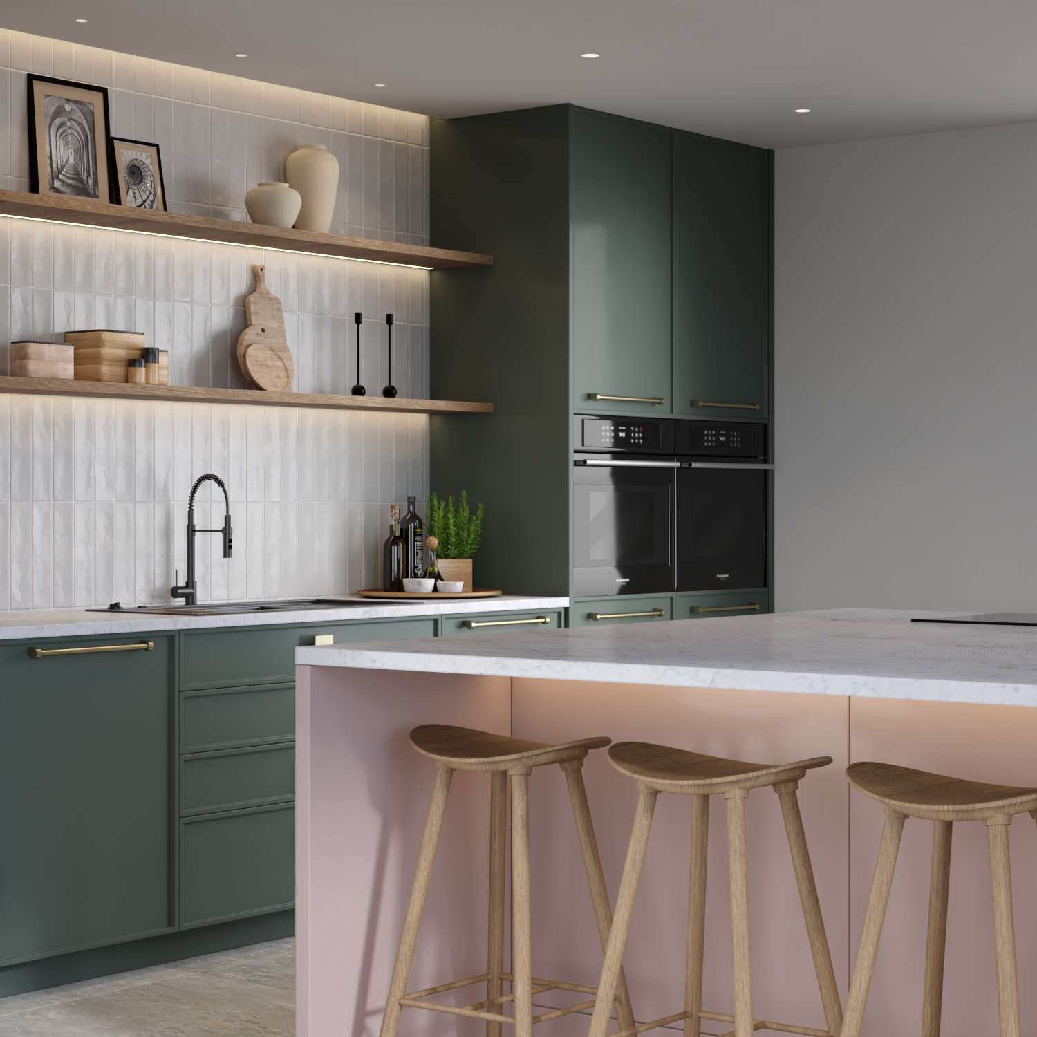
This study began with a colour palette. I came across a combination of soft olive green, pale blush, and warm neutrals that immediately caught my eye — elegant, grounded, and just a little unexpected. It felt like the kind of palette that could shape not just a mood, but an entire interior.
Rather than let it live in a saved folder, I built a kitchen scene to explore how those tones might play out in context — through cabinetry, surfaces, styling and lighting.
For interior designers, architects, and developers alike, great CGI isn’t a luxury anymore, it’s your secret weapon. It sells ideas. It speeds up sign-offs. It stops the blank stares in meetings. But how much does this magic actually cost?
Let’s cut through the vague promises and give you a clear, no-nonsense guide to our special pricing.
Design Intent
The goal was to create a space that felt calm and composed, with every material and detail supporting the palette. The design itself is fairly restrained, which allowed the colours and textures to do the talking.
Key points of focus:
- Cabinetry & Island: The olive green base units were paired with a pale pink island — soft, but structured. It’s a pairing that brings warmth without feeling overly feminine.
- Material Detailing: Brushed brass hardware, subtle tile texture, and soft timber shelving helped ground the scene with a tactile richness.
- Styling: The open shelving became an opportunity to echo the palette in ceramics and accessories, while also introducing variation in scale and shape.
- Lighting: I kept the lighting clean and diffused — the sort of light you’d get on an overcast morning. Nothing dramatic, just enough to bring out texture and soften shadows.
Depth of Field as a Tool
As the composition came together, I used this study to experiment with depth of field — not as an afterthought, but as part of the design process.
I rendered four versions:
- No DOF — Technically clear, but visually flat. Everything competed for attention.
- Auto DOF — A decent baseline, but lacked intent.
- 5 DOF / 6 DOF — These gave the best results. A slight softening of the island drew focus to the joinery and styling above, introducing a subtle cinematic quality that made the scene feel more tactile and photographic.
This part of the process became its own small study — a reminder that DOF isn’t just an effect, but a way to guide attention and express mood.
Reflections
This wasn’t about creating a perfectly resolved kitchen — it was about seeing where a colour palette could lead, and what kind of mood it could carry. The end result feels gentle, thoughtful, and considered — a visual expression of form, function, and feeling, working in quiet harmony.